English
Light and Dark Palettes: Checking Contrast and Its Limits

Management Summary
Contrast is the visible difference between a website element and its background. In light and dark themes, sufficient contrast helps text, controls and selected items remain recognisable. A complete colour palette alone does not establish this: the actual pair of colours, text size, transparency and interaction state matter. This explains why the same design can be readable in one view and difficult in another. Colour calculations are useful guidance, but the displayed page and its operation determine the practical result.
Contents
Light and dark designs can use the same CSS variable names with different colour values. Readability, however, depends on the foreground/background pair actually displayed. A palette supplies possible colours; usage on the page determines which contrasts require checking.
Which threshold applies?
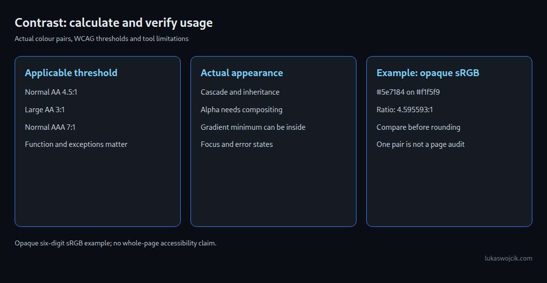
WCAG 2.2 generally requires at least 4.5:1 for normal text at level AA. Large text needs 3:1: at least 18 points or 24 CSS pixels, or 14 points bold, approximately 18.67 CSS pixels. Level AAA requires 7:1 for normal text and 4.5:1 for large text. Exceptions include logos, purely decorative text and text in inactive controls.
Visual information required to identify controls, states or meaningful graphics also falls under non-text criterion 1.4.11. The threshold is 3:1 against adjacent colours, subject to the criterion’s exceptions. Every individual border does not necessarily need that contrast if other sufficiently distinguishable features identify the component.
A low number therefore does not automatically establish a WCAG failure. Function, size, state and actual background come first. Conversely, a variable name such as --border-soft cannot turn a necessary boundary into decoration.
A reproducible example
For opaque foreground #5e7184 on #f1f5f9, the WCAG formula gives approximately 4.595593:1. This particular pair meets AA for normal text. A two-decimal display reads 4.60:1, but the comparison still uses the unrounded value.
#777777 on white gives approximately 4.478089:1 and misses 4.5:1. #767676 on white reaches approximately 4.542225:1. A small colour change can cross the threshold. A target of 4.6:1 provides some margin, but cannot guarantee a pass after later background changes.
The following Python example accepts only opaque six-digit sRGB hex colours. The linearisation breakpoint is 0.04045. The older 0.03928 value selects the same branch for integer 8-bit channels; the example uses the current definition. Alpha, gradients, the CSS cascade and other colour spaces are outside its scope.
"""WCAG 2.2 ratio for two opaque six-digit sRGB hex colours only."""
import re

def luminance(value):
    if not isinstance(value, str) or not re.fullmatch(r"#?[0-9a-fA-F]{6}", value):
        raise ValueError("Expected six-digit opaque sRGB hex colour")
    value = value.removeprefix("#")
    channels = [int(value[i:i+2], 16) / 255 for i in (0, 2, 4)]
    linear = [c / 12.92 if c <= 0.04045 else ((c + 0.055) / 1.055) ** 2.4
              for c in channels]
    return sum(w * c for w, c in zip((0.2126, 0.7152, 0.0722), linear))

def contrast(foreground, background):
    a, b = luminance(foreground), luminance(background)
    return (max(a, b) + 0.05) / (min(a, b) + 0.05)

if __name__ == "__main__":
    ratio = contrast("#5e7184", "#f1f5f9")
    print(f"{ratio:.4f}:1; AA normal text: {ratio >= 4.5}")
Four limits of palette-only checking
- Names do not replace usage.
--on-accentsuggests text on an accent surface, but CSS can use that value elsewhere. A value named soft can also provide important text. - A missing override does not automatically trigger a fallback. A dark theme can inherit values from a shared base. Selectors, cascade and inheritance determine the computed value. A
var()fallback applies under specific conditions; absence of a second declaration alone does not establish a defect. - Transparency and gradients need the actual background. Alpha specifies transparency. The visible colour is calculated by combining the partly transparent colour with the layers beneath it. Images or gradients require checking the least favourable relevant area behind the text. That area can be inside a gradient, not just at an endpoint.
- States change the pairs. Focus, hover, selection, error messages and raised cards can introduce different backgrounds. A correct default pair does not approve every state or the entire website.

Focus and form labels
A focus indicator marks the control currently selected for keyboard input, for example with a visible outline. An author-designed focus indicator must meet the applicable requirements for distinguishable states. WCAG 2.4.13 at level AAA adds indicator-area requirements and at least 3:1 between the same pixels in focused and unfocused states. This differs from adjacent-colour checking under 1.4.11. Unmodified browser styling and other explicitly listed cases have specific exceptions.
Placeholder text in an active field needs the applicable text contrast. A readable placeholder still does not replace an appropriate label because the hint disappears during input. Purpose and examples should remain understandable while editing.
What the tool can establish
The linked palette auditor calculates colour pairs locally in the browser. The current implementation extracts declarations with a text pattern and guesses roles from names. It does not resolve the real CSS cascade: the first occurrence wins when a name is repeated, and declarations inside comments can also be read. Values containing var() or oklch() are not resolved.
Alpha values are flagged but excluded from the contrast calculation. An isolated test with completely transparent black on white therefore reports 21:1 and a good overall verdict despite an alpha warning. Another test treats --text-soft as decoration and excludes that value from findings. A good result is consequently only a clue about recognised hypothetical pairs, not acceptance testing of the rendered interface.
Six isolated tests of the tool logic and twelve tests of the Python example support these specific statements. The calculations do not replace visual and state checks in a browser. A defensible review covers both themes, actual colour combinations and relevant control states.
Questions and answers
Can a displayed ratio of 4.50 still fail?
Yes. A value just below 4.5 can round to 4.50. The decision must precede rounding.
Is a faint border always decoration?
No. Function matters, not colour or variable name. Information needed for operation or understanding requires the applicable checks.
Do two complete palettes prove accessibility?
No. Palette completeness and contrast calculations cover only part of the requirements. Actual rendering, states, labels and other WCAG criteria still need separate assessment.
Related articles