English
Tutorial: Real-Time E-Commerce Anomaly Monitoring for add_to_cart and begin_checkout

Contents
- Step 1: Pulling Live Counts with the Realtime Reporting API
- Step 2: A Baseline Light Enough to Refresh Every Few Minutes
- Step 3: Computing the Deviation and the Status
- Step 4: Making Drops Visible with Conditional Formatting
- Step 5: Putting It Where the Team Actually Looks
- Staying Inside the Guardrails
- Questions and answers
- Sources
A statistical daily audit catches a broken purchase event within a day; during a flash sale or right after a deploy, a day is too slow. Detecting a drop in add_to_cart or begin_checkout events while it is still happening needs a data source with only minutes of latency — GA4’s own BigQuery export runs as a daily batch and is not built for a dashboard that refreshes every few minutes. The GA4 Realtime Reporting API is: it returns event counts from roughly the last 30 minutes, and is available on every GA4 property, including the free tier.
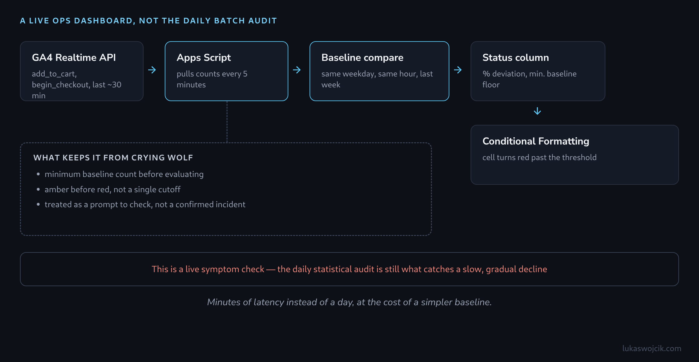
The following walkthrough builds a lightweight operational dashboard around that API. It is a Google Sheet refreshed every few minutes by Apps Script. In it, the live add_to_cart and begin_checkout counts sit next to the same time of day a week earlier. Conditional Formatting turns the relevant cell red the moment the drop crosses a threshold.
Step 1: Pulling Live Counts with the Realtime Reporting API
The GA4 Data API’s runRealtimeReport method accepts eventName as a dimension and eventCount as a metric, filtered to the property’s realtime data — no BigQuery export is involved. Apps Script’s built-in Analytics Data API advanced service can call it directly from a script bound to the dashboard sheet:
function pullRealtimeCounts() {
  const propertyId = 'properties/XXXXXXXXX';
  const request = {
    dimensions: [{ name: 'eventName' }],
    metrics: [{ name: 'eventCount' }],
    dimensionFilter: {
      filter: {
        fieldName: 'eventName',
        inListFilter: { values: ['add_to_cart', 'begin_checkout'] }
      }
    }
  };
  const response = AnalyticsData.Properties.runRealtimeReport(request, propertyId);
  return response.rows || [];
}
A time-driven trigger runs this function every five minutes and appends the two counts, with a timestamp, to a log tab — the raw material both the live status and the baseline comparison are built from.
Step 2: A Baseline Light Enough to Refresh Every Few Minutes
A 14-day rolling Z-score baseline is the right tool for a daily statistical audit, but it is overkill for a live dashboard meant to answer one question quickly: is the current volume roughly where it should be right now. A same-weekday, same-time-of-day comparison from exactly seven days earlier is simpler to compute and easier for a person glancing at a screen to reason about — a separate, once-daily trigger stores each day’s counts by hour, so the current pull always has last week’s equivalent hour to compare against.
Step 3: Computing the Deviation and the Status
A formula column turns the two counts into a percentage deviation and a status label:
=IF(baseline_count=0, "n/a",
   ROUND((current_count - baseline_count) / baseline_count * 100, 1))
Below roughly ten baseline events, a percentage swing stops meaning anything — a single missing event reads as a 50% drop overnight. A minimum baseline floor (for example, only evaluating the status once the baseline count passes 20) keeps the dashboard from crying wolf during the quietest hours.
Step 4: Making Drops Visible with Conditional Formatting
The actual highlighting is done by a custom-formula conditional formatting rule on the status column: red when the deviation falls below -30, amber between -30 and -15, and no fill above that. It is the same visual pattern used for a statistical audit’s dashboard, applied here directly in Sheets. The ops view therefore updates the moment Apps Script appends a new row, with no extra data source and no connector in between.
Step 5: Putting It Where the Team Actually Looks
The sheet works on its own for anyone with edit or view access, but pinning it to a shared screen during a launch window, or connecting it into Looker Studio as one tile among several, keeps it visible without anyone needing to have the sheet open. When it does go into Looker Studio, the data-freshness setting on the Sheets connector needs to be turned down from its default — otherwise a five-minute Apps Script refresh sits behind a much slower cache and the point of building this in the first place is lost.
Staying Inside the Guardrails
This dashboard is a live symptom check, not a replacement for the statistical audit that runs against the completed day’s data — it will miss a slow, gradual decline that never crosses its threshold in any single five-minute window, which is exactly what a rolling baseline is for. Treat a red cell here as the prompt to go look, not as a confirmed incident on its own: a flash sale that legitimately triples add_to_cart volume, or a genuinely quiet hour, can both produce a swing outside the threshold without anything being broken.
Questions and answers
Where does last week’s figure come from if the Realtime API only reaches back about 30 minutes?
From what the dashboard recorded itself, or from the regular reports. The Realtime Reporting API holds nothing beyond its window, so a figure from seven days ago has to either sit in the dashboard’s own log tab or come from the GA4 Data API’s runReport method, drawn from the processed daily data, for example by hour.
What matters is that both figures cover the same window. A realtime value spans roughly 30 minutes, an hourly count 60. With even traffic the realtime value therefore contains only about half the events of last week’s hour, and the formula shows a deviation of −50% although nothing is broken. The hourly count has to be halved before the comparison, or the comparison uses the log entry written exactly seven days earlier at the same time of day, which covers the same window.
The second approach has a side effect: it needs a full week of log before the first status means anything.
Why does the cell not turn red immediately after a complete outage?
Because every pull counts the last 30 minutes or so, and consecutive pulls overlap. If the event stops completely at a given moment, the next pull five minutes later still contains 25 minutes of healthy data. With even traffic, the arithmetic gives:
- after 5 minutes about −17%, so amber,
- after 10 minutes about −33%, so red,
- after 30 minutes −100%.
A complete outage therefore becomes visible after about ten minutes, a partial one later or not at all. If only half the events drop out, the deviation reaches −50% only after the full window and crosses the −30 threshold no earlier than the pull after 20 minutes; a loss below 30% never turns the cell red.
Does the dashboard also fire when only the measurement breaks and the shop keeps working?
Yes, and it cannot tell the two apart. It counts events in GA4, not carts: a tag that stops firing after a deploy, or a changed consent banner that fewer visitors accept, produces the same red cell as a broken checkout. A look at the orders in the shop system settles which case applies.
Sources
Related articles