English
 Deutsch
 Polski
Tutorial: Building an SEO and GEO Visibility Dashboard on the Search Console API

Contents
The Search Console interface answers one query at a time. It shows the top rows, exports a thousand of them, and offers no way to ask whether visibility for a whole topic is rising while brand searches merely hold steady. That question needs the queries grouped, and grouping needs both more rows than the interface hands over and a place to define the groups.
The following walkthrough builds that: pulling the data through the Search Console API, categorising queries with regular expressions in Looker Studio, and reading the resulting clusters — including an honest account of what this data cannot show about answers generated directly on the results page.
What the API Gives That the Interface Does Not
The performance report exports up to a thousand rows. The searchanalytics.query method of the API returns up to 25,000 per request and pages through the rest with startRow, which is the difference between seeing the head of the distribution and seeing the long tail where new topics first appear.
POST https://searchconsole.googleapis.com/webmasters/v3/sites/
     https%3A%2F%2Fexample.com%2F/searchAnalytics/query

{
  "startDate": "2026-07-01",
  "endDate": "2026-07-31",
  "dimensions": ["query"],
  "rowLimit": 25000,
  "startRow": 0,
  "dimensionFilterGroups": [{
    "filters": [{
      "dimension": "query",
      "operator": "includingRegex",
      "expression": "(?i)(pricing|cost|licen[cs]e)"
    }]
  }]
}
For a dashboard, Looker Studio’s native Search Console connector calls the same API without any code, which is the practical route unless the data is being warehoused. Its one structural constraint is worth knowing before designing anything: the connector offers a site-level table and a URL-level table, and query and landing page can only be combined in the URL-level table. Its figures are aggregated by page and therefore do not add up to the site-level totals. That is a property of the Search Console data itself, not of the connector, and no calculated field works around it.
Two Regex Rules That Decide Whether Any of This Works
Both places where a regular expression can be written behave in a way that surprises people who know regex from elsewhere.
Search Console uses RE2, which has no lookahead and no lookbehind. The familiar trick for non-brand — a negative lookahead excluding the brand name — simply fails to compile. The supported approach is the filter’s own inversion: a custom regex filter set to doesn’t match, with the brand pattern as the expression.
Looker Studio’s REGEXP_MATCH requires the pattern to match the entire field value, not a fragment of it. A pattern of acme matches only the query that is exactly the word acme; matching any query containing it needs the wildcards spelled out:
-- Field: Brand vs non-brand
CASE
  WHEN REGEXP_MATCH(Query, '(?i).*(acme|acme corp|acmecorp|acme app).*')
    THEN 'Brand'
  ELSE 'Non-brand'
END
The (?i) flag makes the match case-insensitive in both systems. The brand alternation is worth over-populating from the start: misspellings, the spaced and unspaced form, and the product name all belong in the brand bucket, because every one of them left outside inflates the non-brand figure with searches that were never won on merit.
Turning Topics into Clusters
The same construction, extended, becomes the dimension the dashboard is built on. Order matters — the first matching branch wins, so brand belongs first, or a branded search for a feature lands in that feature’s cluster:
-- Field: Query cluster
CASE
  WHEN REGEXP_MATCH(Query, '(?i).*(acme|acmecorp).*')            THEN 'Brand'
  WHEN REGEXP_MATCH(Query, '(?i).*(pricing|cost|how much).*')    THEN 'Pricing'
  WHEN REGEXP_MATCH(Query, '(?i).*(integrat|api|webhook|sync).*') THEN 'Integrations'
  WHEN REGEXP_MATCH(Query, '(?i).*(vs |alternative|compare).*')   THEN 'Comparison'
  ELSE 'Unmatched'
END
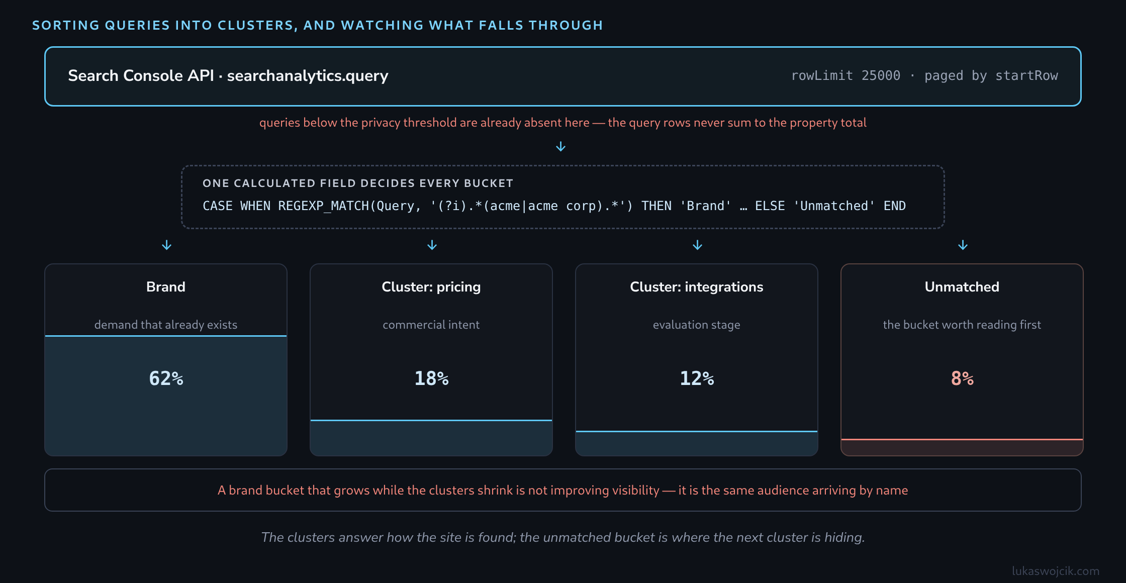
Keeping an explicit Unmatched branch rather than a catch-all label is what makes the field maintainable. That bucket is a working queue: sorted by impressions, it lists the demand the taxonomy has not accounted for yet, and every cluster after the first two usually comes out of reading it.
Reading the Dashboard
A cluster dimension makes three charts sufficient. Impressions by cluster over time show whether visibility is broadening or concentrating. Clicks and CTR per cluster show whether that visibility converts into visits. A table of the unmatched queries feeds the next iteration of the taxonomy.
The trap in this view is the brand cluster. Brand searches rise with awareness, with campaigns, and with seasonality, and they convert far better than anything else — so a total that looks healthy can hide non-brand clusters shrinking underneath it. Reporting brand and non-brand as separate lines rather than as one visibility total is what keeps that visible.
What This Data Cannot Say About Generative Results
Search Console has no dimension for AI-generated answers. Impressions that occurred inside a generative result are included in the same performance data as ordinary results, and there is no filter that separates them, so any dashboard claiming to measure generative visibility from this source is inferring rather than measuring.
What the data does support is a pattern worth watching: an informational cluster whose impressions hold steady or grow while its clicks and CTR decline, over a period with no ranking loss to explain it. That shape is consistent with answers being satisfied on the results page. It is also consistent with a changed snippet or a shifted mix of queries within the cluster, which is why it belongs in a report as a question to investigate rather than a metric to present.
Staying Inside the Guardrails
Three properties of the source data limit what the dashboard can honestly claim. Rare queries are withheld entirely for privacy reasons, so the query rows will always sum to less than the property totals — the difference is not a bug to reconcile, and cluster shares should be read as shares of the queries that are reported.
History stops at sixteen months, which makes year-over-year comparison possible but not a second year of it, so anything longer needs its own storage. And average position is already an impression-weighted average within each row; averaging those averages across a cluster produces a number that looks precise and means very little, which is why impressions and clicks carry the argument better than position does.
Questions and answers
Without lookahead, how can a two-part condition be expressed, such as capturing brand and product names while excluding competitors?
Through ordering and separate filters rather than negation inside the pattern. That is the substitute RE2 leaves, and it goes further than it first appears.
In the calculated field, the first matching branch wins. A branch for competitors therefore goes before the branch for brand and product: a query containing both names lands in the competitor bucket rather than in the brand bucket. The exception is expressed without any pattern having to exclude anything.
For filtering, inversion does the same job. In the API, a filter group takes two filters that apply together: one with includingRegex and the brand pattern, one with excludingRegex and the competitor pattern. In Looker Studio, a chart can likewise carry two filters, one including and one excluding. Two filters instead of one expression.
The order of the branches and the split into two filters both deserve a comment, because both will later look accidental. A short note on the field explaining which branch comes first and why saves the next person from reconstructing it from the data.
Related articles