The GA4 Dashboard: Six Card Types, a 15-Card Limit and No Segments

Contents
Google has rebuilt the reporting workspace around a single button. At the top of the Reports navigation sits + Create, and choosing Dashboard from it opens a grid canvas. Dimensions and metrics are dragged onto that canvas, a panel on the right adjusts whatever card is selected, Save keeps the work and Publish writes the finished page straight into the left navigation of Reports.
What the dashboard is good for follows from four published numbers and three published absences, and those are worth reading before a Looker Studio page gets retired in its favour.
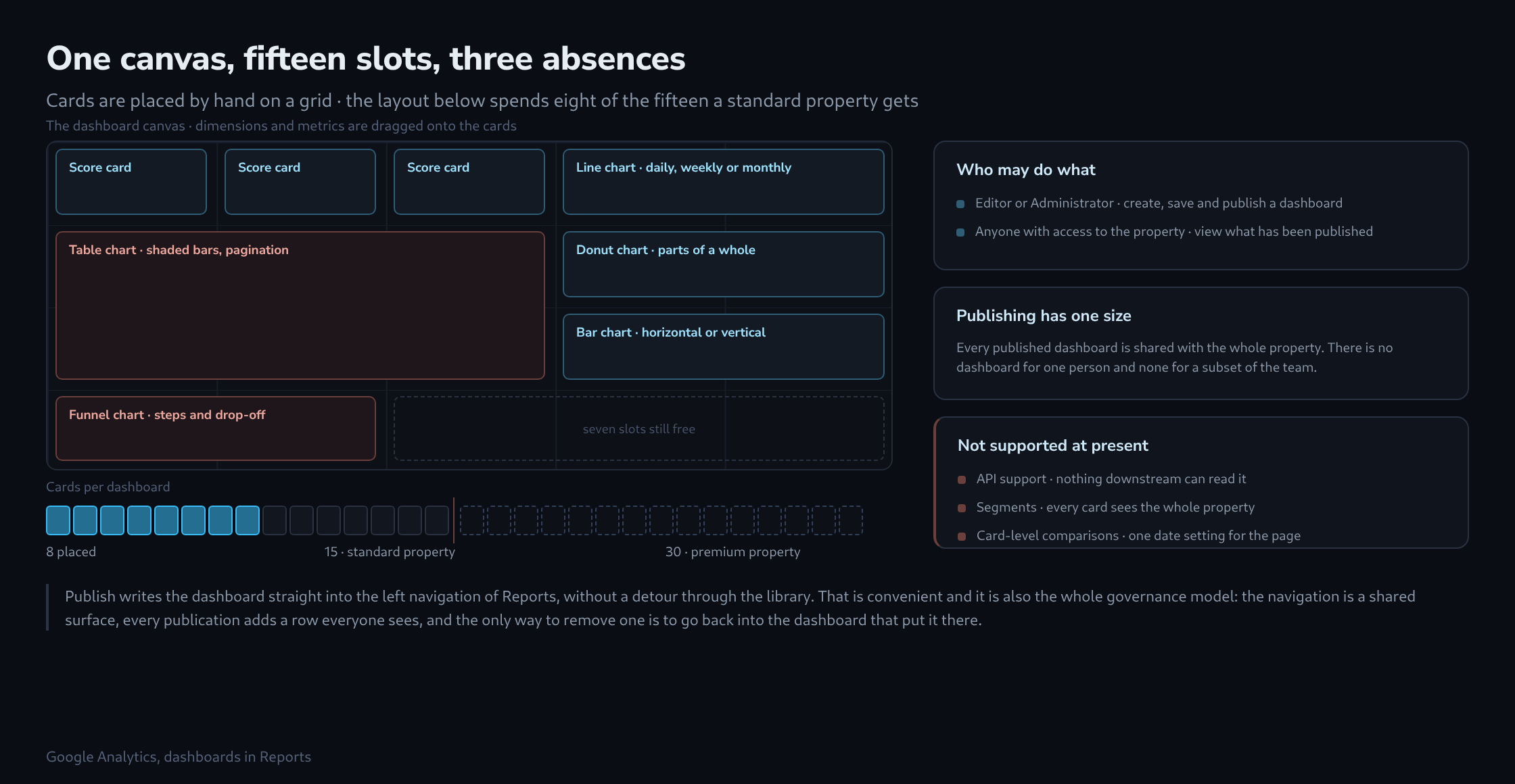
Six card types, and what each is built for
The canvas takes six kinds of card, and the list is short enough to hold in mind while planning a page.
Score card    a single KPI, with the percentage change
              shown when a date comparison is applied

Table chart   rows of detail, with shaded bar graphs
              inside the cells and pagination

Line chart    a metric over time, at daily, weekly
              or monthly granularity

Bar chart     dimensions compared, horizontally
              or vertically

Donut chart   parts against a whole

Funnel chart  conversion steps, and where the
              drop-off happens
The grid does the rest: cards are placed by hand, aligned and resized, so a page can be arranged the way it will be read rather than in the order the questions were asked.
Fifteen cards, thirty on premium
A standard property allows a maximum of 15 cards per dashboard; a premium property, meaning the paid tier, allows up to 30. That is a firm number and it shapes the planning more than any of the visual options do.
Fifteen sounds generous until a page has a row of score cards across the top. Four of those plus a line chart and a table already spend six, and a second section for a different channel spends six more. The practical consequence is one dashboard per audience rather than one dashboard for the whole business, which also matches how the pages get read: nobody scrolls a shared page looking for the three cards that concern them.
Three absences, and what each rules out
The documentation names three things as not supported at present: API support, segments, and card-level comparisons. Each one closes off a different kind of use.
No API means nothing downstream can read the dashboard. There is no scheduled export, no copy landing in a warehouse, no second system rendering the same cards. Whatever is on the page exists only on the page, and any figure that has to travel needs a different route out of Analytics.
No segments means every card sees the property as a whole. Two audiences side by side has to be built out of dimensions instead: two bar charts filtered by a dimension value rather than one chart split by a segment. For anything where the population itself is the question, this is the limit that bites first.
No card-level comparisons means one date setting governs the whole page. Comparison is not gone — a date comparison makes the score cards show their percentage change — but it applies everywhere at once. A page that needs last week on one card and last year on another cannot be built here.

Publishing has exactly one size
Creating and publishing a dashboard requires Editor or Administrator rights on the property. Viewing requires nothing beyond access to the property itself: anyone who can open it sees every dashboard that has been published.
And every published dashboard is shared with the property. There is no personal dashboard, no draft visible to one team, no publication to a subset. The left navigation of Reports is a shared surface, and each publication adds a row that everybody sees.
On a property with several agencies or several internal teams that turns naming into a real decision rather than a nicety. The habit worth adopting on day one is a prefix per owner and a review of the list at some fixed interval, because the navigation only grows on its own.
Where it sits next to what already exists
Standard reports answer a fixed set of questions and cannot be rearranged. Explorations answer open questions and bring segments, free-form techniques and per-exploration comparisons. The dashboard is the flat layer between the two: fixed like a report, arranged like an exploration, and permanently visible in the navigation.
Which makes the replacement question narrow and answerable. A Looker Studio page that only ever read GA4, only ever got looked at, and only ever used one date range is better off inside Analytics, with one fewer connection to break and one fewer tool to hold rights in.
A page that blends GA4 with Ads cost data or a spreadsheet, that goes to somebody without property access, that gets mailed on a schedule, or that carries more than fifteen cards, stays where it is. The test is short enough to run in a minute, and it is the whole decision.
Related articles