English
 Deutsch
 Polski
GA4 Behavioural Modelling: The Two Eligibility Thresholds and Where Modelled Figures Appear

Contents
The common reassurance after consent mode arrived was that modelling would catch the refusals. For most sites that is not true, and the reason sits in two sentences on Google’s help page.
Behavioural modelling needs at least 1,000 events per day with storage denied, on at least seven days. And it needs at least 1,000 daily users sending events with storage granted, on at least seven of the previous 28 days. Both conditions at once.
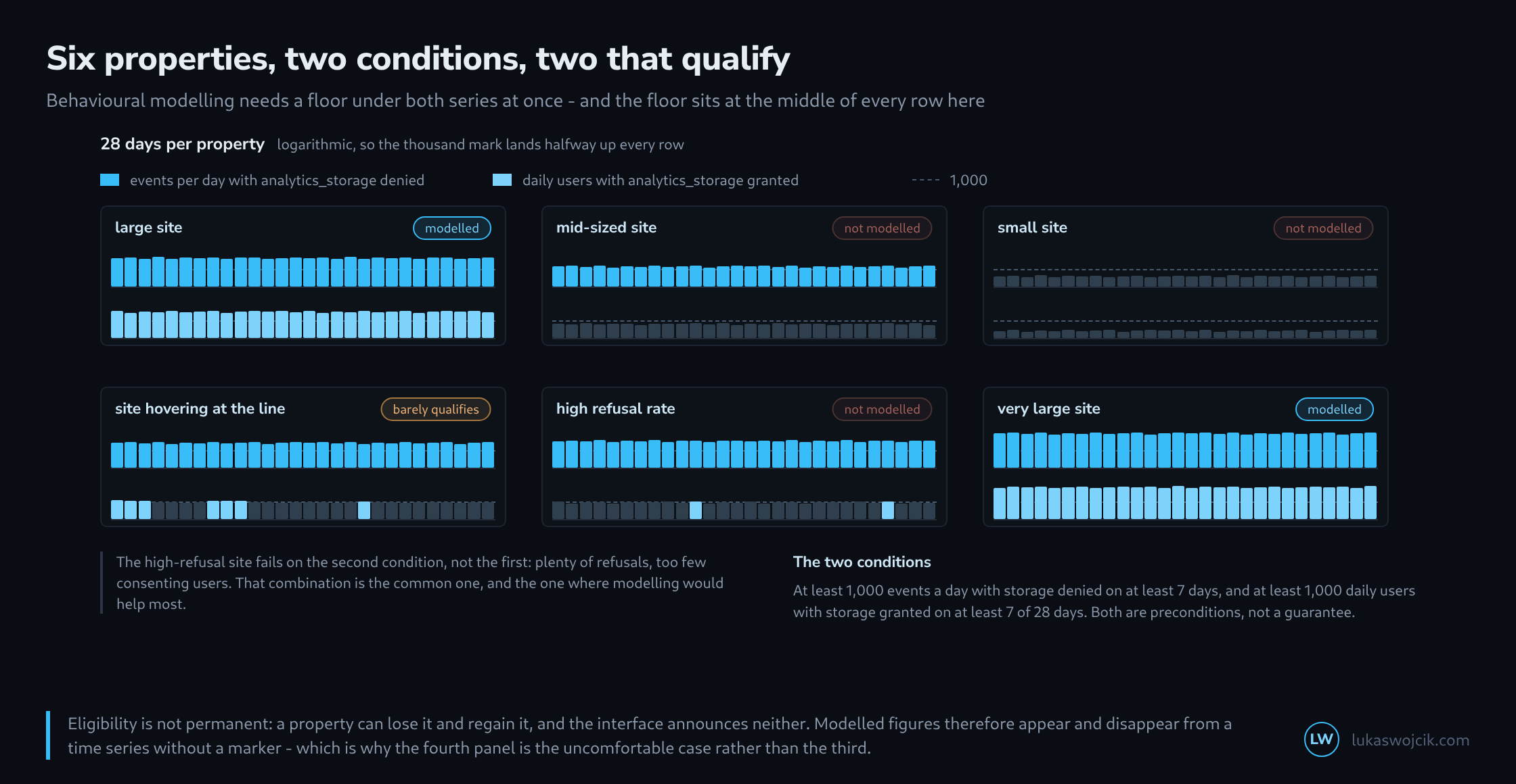
The two conditions are not symmetrical
The difference in wording is easy to skim past and decides the case: the first condition counts events, the second counts users. A site with many page views per visit reaches the first mark considerably sooner than the second, because one person generates a dozen events in a day and still remains one user.
Then there is the windowing. The first condition asks for seven days, the second for seven out of 28. Both are minimums on rolling windows, and neither appears anywhere in the interface as a progress indicator.
Why the second condition is the harder one
Modelling needs examples. It transfers the behaviour of consenting people onto refusing ones, and for that it needs enough consenting people – not enough refusing ones. This puts a site with a high refusal rate in an awkward position: plenty of gaps to fill and too little material to fill them with.
That exact case is the fifth panel in the picture. The upper row sits far above the line, the lower one just below, and the verdict is nonetheless: not modelled. Anyone looking only at the refusal rate reads that as a fault.
Where modelled figures appear and where they do not
Once the thresholds are met, estimated values appear in the standard reports, for instance under users, sessions and new users. The list of where they do not appear is longer and matters more in practice.
Modelled values appear in

  standard reports          users, sessions, new users

Modelled values do not appear in

  BigQuery export           not at all
  audiences                 no
  user explorer             no
  cohort exploration        no
  segments with sequences   no
  retention reports         no
  predictive metrics        no
  path and funnel analysis  handled differently

  Consequence: the interface and the export count differently,
  and both are right. The difference is the modelling.
The report in the interface therefore holds a figure that cannot be reproduced from the export – not through a fault, but because one figure contains an estimate and the other does not. Using both sources side by side and hunting for the discrepancy means hunting for something that has no cause in the data.
Eligibility is not permanent
Google’s page states explicitly that a property which once met the prerequisites and later does not loses the estimated data – and gets it back if it meets them again. Neither transition is announced.
For a time series that means the counting method can change mid-course without a note beside it. A site with seasonal traffic may pass through this twice a year. The fourth panel is therefore the uncomfortable case rather than the third: missing the line clearly at least yields a consistent time series.
The page likewise states that the external prerequisites are not a guarantee. The model applies criteria of its own on top, and the ones named are the ratio of new to returning users and the ratio of users to sessions.
What follows from this
The thresholds themselves can be checked, and that is the first step. Two figures suffice: events per day with storage denied, and daily consenting users. Both are in the property, and the answer is a yes or a no rather than a feeling.
If the answer is no, the consequence is not helplessness but clarity: the reported figures are then counted values from consenting people only, and the refusing portion is missing entirely. That is an honester basis than a figure whose estimated share nobody knows. Estimating the missing portion anyway means doing the arithmetic oneself – and that arithmetic starts with the refusal rate, which is measurable in any case.
Questions and answers
How many daily users does a site with a high refusal rate need for modelling to be possible at all?
The second condition can be converted directly. If 1,000 consenting users per day are required and a share q refuses, the site needs at least 1,000 / (1 − q) users a day in total. At an assumed refusal rate of 60 per cent that is 2,500, at 80 per cent 5,000, in each case on at least seven of the previous 28 days. The calculation assumes that the rate refers to users; a rate per session or per banner impression can differ.
The first condition is then usually met already, but only if refusing visitors send events at all. That only happens when the tag loads without consent too and sends cookieless pings, as in advanced consent mode. In basic mode the tag loads only after consent, no events with storage denied arise, and the first condition stays at zero, however large the site is.
Does a GA4 setting also decide whether modelled figures appear?
Yes, the reporting identity setting, which determines which identifiers GA4 uses to attribute activity to users. Modelled figures only appear with the Blended option; with Observed or Device-based, the reports show counted values only, even when both thresholds are met. The setting affects reporting only, not data collection, so switching it also changes retroactively which figure a time series shows.
Related articles